Chart Display Functionality
In AskTable, not only can we ask questions in natural language, but we can also automatically generate intuitive charts, including:
- 📈 Line chart
- 📊 Bar chart
- 🥧 Pie chart
These charts will be intelligently generated along with your questions and data, helping you understand data changes and trends at a glance.
✅ What kind of questions will generate charts?
When your question involves numerical comparisons, trend analysis, or categorized summaries, AskTable will automatically attach the corresponding chart to the answer.
Example questions:
- "What are the differences in GDP across provinces?"
- "How much was the sales volume each month in 2023?"
- "What is the sales share for each brand?"
AskTable will automatically identify the analytical intent of these questions and generate the corresponding charts. For example:
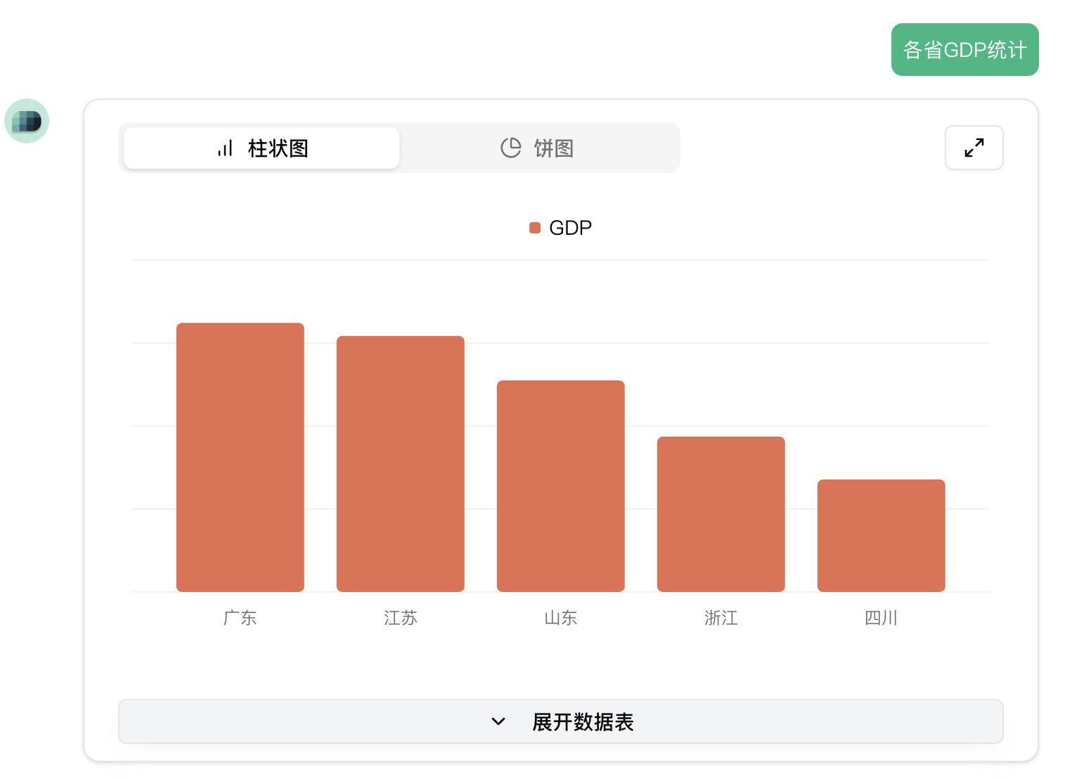
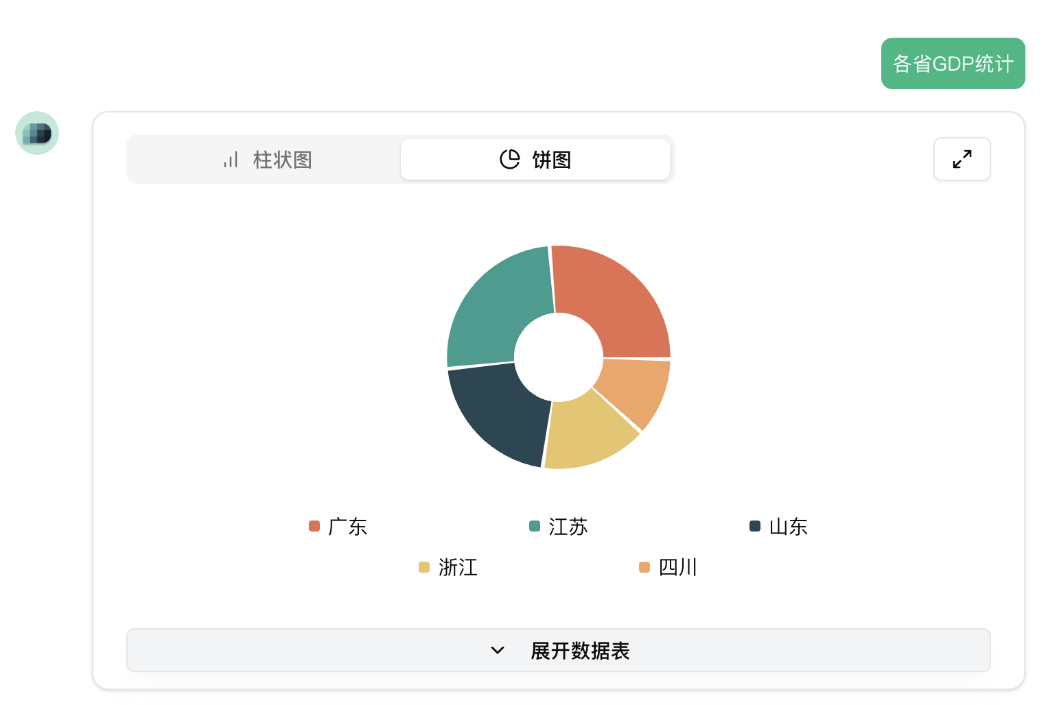
Question: Statistics on provincial GDP
Answer:
Text listing provincial data
- Chart: Bar chart showing GDP rankings
- Chart: Pie chart showing GDP distribution by province
🖼 Chart Examples
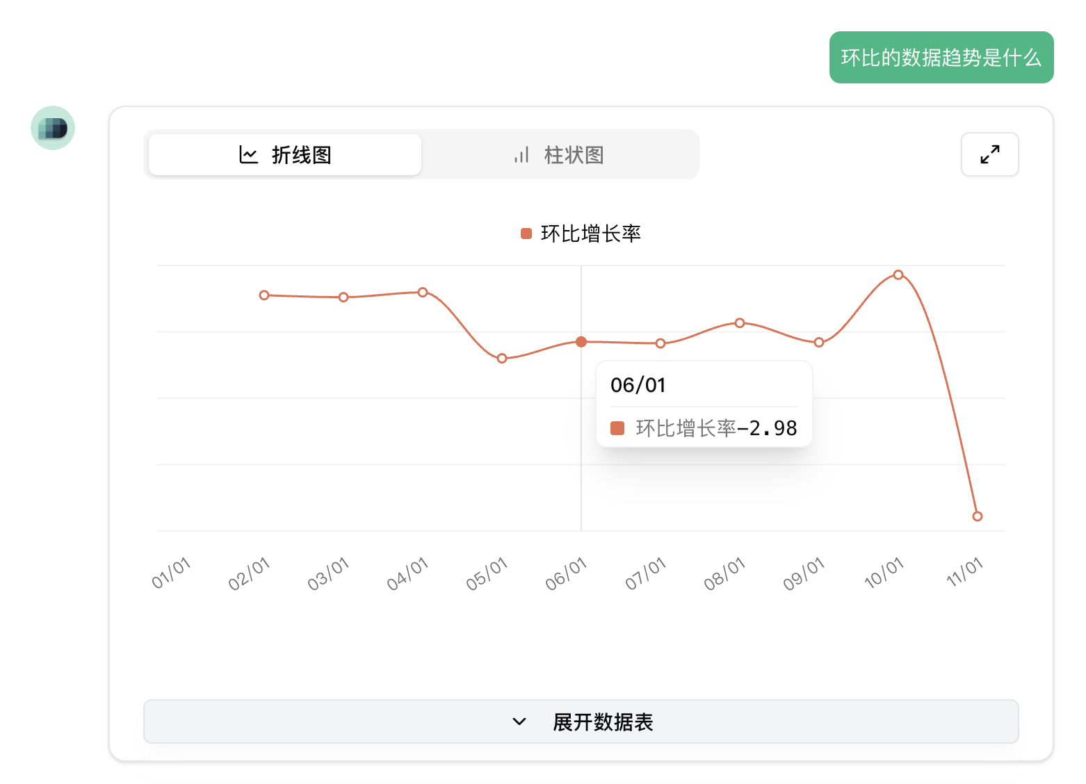
Line chart:
- Shows changes in data over a continuous time period (e.g., monthly sales, quarterly revenue)
Bar chart:
- Displays the GDP values for each province
- Can be arranged horizontally or vertically
Pie chart:
- Displays the proportion of each category in the whole (e.g., sales share by brand)
🔍 Where do the chart data come from?
AskTable will automatically extract and analyze data from the uploaded Excel files or connected databases:
- Automatically generates SQL query statements
- Extracts results and structures them as tables (DataFrame)
- Generates the best type of chart based on the content (can be bar chart, pie chart, or line chart)
✨ Why are charts important?
Charts allow you to:
- Quickly discover patterns and anomalies in the data
- Clearly communicate information to your team
- Reduce the reading pressure of complex tables
📌 Tips
You can also use more specific language to specify the chart:
- "Please draw a trend chart of sales volume each month"
- "Please show the proportion of each category using a pie chart"
- "A horizontal bar chart would be clearer"
AskTable will automatically understand your needs and generate the corresponding chart.